iN2015 Poster Prototypein [ Assignment 4 ]
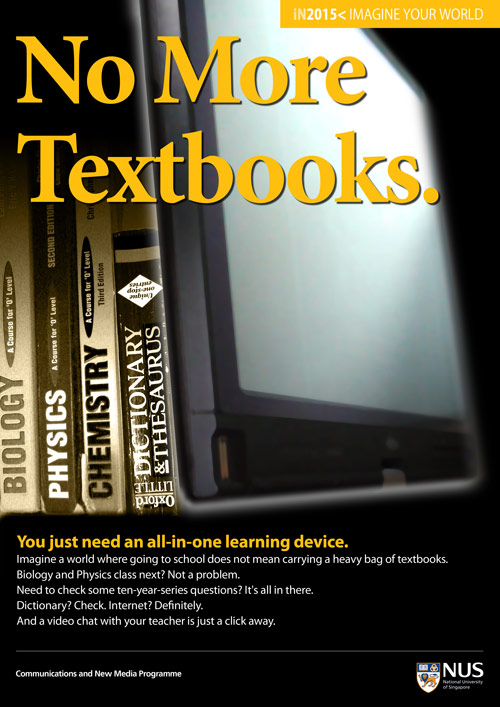
Here’s the poster which I came up with:
While designing it, I realised that my 5 megapix camera is not good enough for an A3 size print. And the picture of the laptop screen turned out noisy. So I’ve to use some Photoshop filters to ‘save’ it. Hmm.
Posted in Assignment 4 16 years, 9 months ago at 6:56 pm. 4 comments
Previous Post: Photo Taking Next Post: iN2015 Poster Version 2


Comments from the class:
– not futuristic looking enough
– too corporate looking
– colours like ‘national geographic’
– it’s ‘no more textbooks’ but why are there still textbooks?
– make the textbooks ‘morph’ into the screen?
– make the device/screen more obvious
– line up the textbooks in a circle / in a line / on the screen
I would say this is a typical corporate styling and it is a safe design. Perhaps you that think about a transition between books and the Tablet? Like pages flying into the screen?
I agree that it is a very safe corporate design. Perhaps I’ve been designing too many posters for such purposes in my work for school and CCA last time. Will try to amend/improve it soon!
Great use the layering function in Photoshop to help you achieve the form and function?