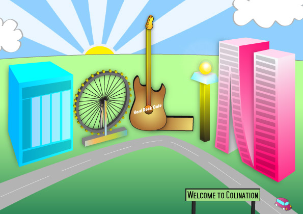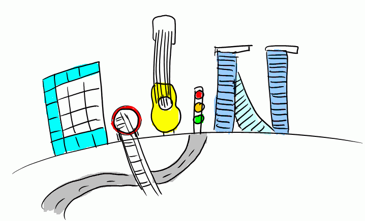
Here’s the final amended version for Me, Myself and I. Based on the comments in class, I delete the roads that go into the background, increased the signs of all the buildings, and tilted the guitar building. I also changed the ‘O’ to a Singapore-Flyer-like structure, to accompany the Marina-Bay-Sands-inspired ‘N’, which is now made more obvious by joining the two buildings closer together and adding gray windows to the first one. I also added a sun and shifted the rays slightly to follow the rule of thirds. The car has also been shifted, and I decided to add a road sign. Colination indeed.
While creating the flyer, it somewhat looked like a bicycle wheel. Haha. I guess this graphic truly depicts the nation in colination with all the buildings and also my love for music and Singapore architecture.
Posted 16 years, 9 months ago. Add a comment

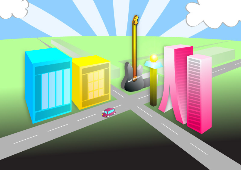
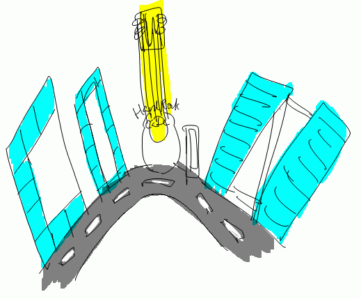
Here’s my final draft. I decided to stick to the 3D idea as I thought it is more aesthetically pleasing. I challenged myself and learnt how to draw in perspective from a tutorial online. The C and O are quite obvious, while the L is the Hard Rock Cafe guitar building (with a little extension to make it more obvious) and the I is the airport-like tower. The N is inspired by the Marina Bay Sands IR. Personally I think it is quite okay except the background looks a bit weird.
Posted 16 years, 9 months ago. 1 comment

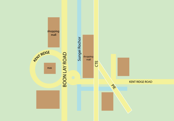
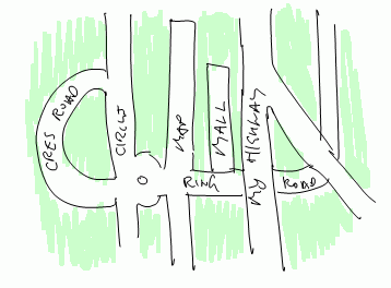
I thought the map idea was not bad and decided to play with Illustrator and created this map. Looks pretty good, but my name isn’t that really well brought across.

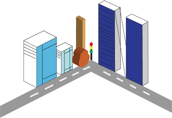
I then tried to do the other idea – the street buildings one – in Illustrator. The idea is good, but I can’t really draw in 3D, so it turned out pretty weird. Definitely needs more work. Someone mentioned during tutorial that it has the ‘Orchard Road’ kind of feel and with some refinement it should look good.
I decided to sketch out another rough of the street idea, but this time in 2D look. Looks fine, perhaps I would go with this since it is easier to draw in 2D, vector style in Illustrator.
Posted 16 years, 9 months ago. Add a comment
After some thought and elimination, I came up with 4 preliminary sketches:

This one is based on the street directory idea. Since I love maps and streets, why not create my name out of them?

This is expanding upon the street idea but more of a “zoomed-in” level where you can see buildings etc. The buildings then form the letters of my name. I also included a Hard Rock Cafe-style guitar building for the ‘L’.

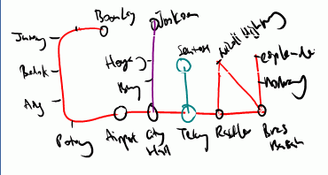
This one is based on the MRT map. I love trains too. So here’s an MRT map of my name. Haha.
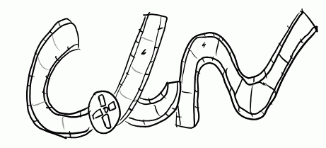
 And of course, I love films. So here’s some film strips rolled to the shape of the alphabets.
Posted 16 years, 9 months ago. Add a comment

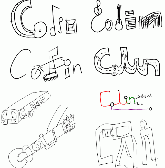
I thought of some keywords such as Film, Trains, Maps, Computers, Internet, Graphics, Music, Piano, Guitar, Cycling, Blading and then came up with these thumnail sketches. I was trying to integrate letters into the elements which I thought of. Some of them were not very easy or good looking.
Posted 16 years, 9 months ago. 1 comment

